Pre-landing pages are a key component in affiliate marketing, often the unsung hero behind high-converting campaigns. These pages act as the middleman between the ad and the landing page, warming up the audience, filtering out unqualified leads, and boosting conversion rates. If you’re looking for inspiration, check out these affiliate marketing pre-landing page examples across key verticals. Whether you’re promoting gambling, betting, utilities, nutra, sweepstake, finance,e-commerce, ordating offers, a well-designed pre-landing page can make all the difference.
In this guide, written by ROIads experts, we’ll break down strategies by vertical, providing real-world examples and actionable insights to help you drive better results in your pop ad campaigns. By understanding what resonates with your audience and tailoring your pre-landings accordingly, you’ll set the stage for higher engagement and improved campaign performance.
Gambling Pre-Landing & Landing Page Examples: Engaging Through Interactive
In the gambling niche, the primary objective of a pre-landing page is to engage users through visual excitement and interactive features. The aim is to make the experience seem like easy money or an exciting challenge while motivating users to register or make their first deposit. With the right hooks, users feel they are on the verge of winning, which significantly increases conversion rates.
Common Pre-landing Page Types:
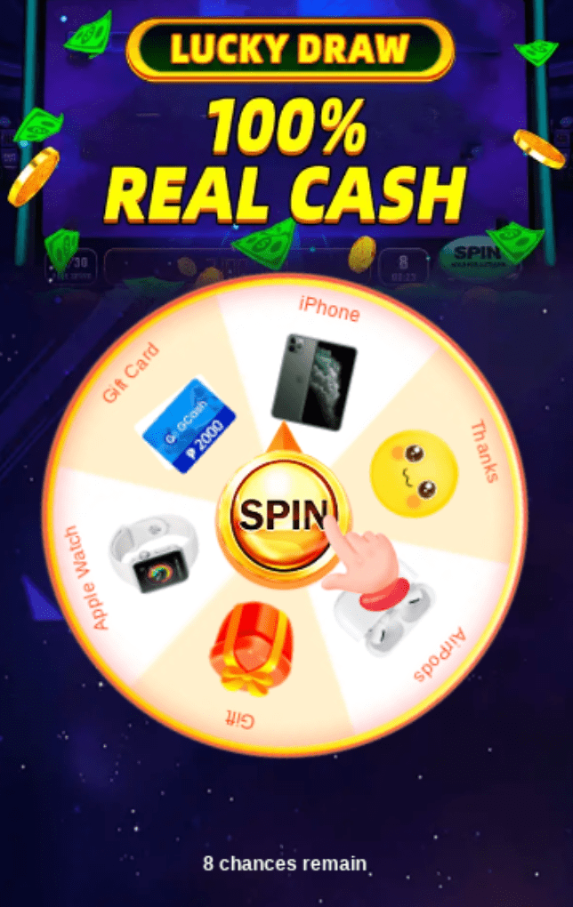
- Lucky Draws and Spin the Wheel Promotions:
These pre-landers encourage users to “win” by spinning a wheel for enticing rewards like cash prizes, electronic gadgets (e.g., iPhones, Apple Watches), or gift cards. The element of chance makes the offer feel exclusive, boosting engagement. The first image above, showing a “Spin the Wheel” creative, perfectly exemplifies this strategy. Users feel a sense of achievement even before they’ve signed up, which enhances their likelihood of completing registration or making a deposit.
- Registration Incentive Pages:
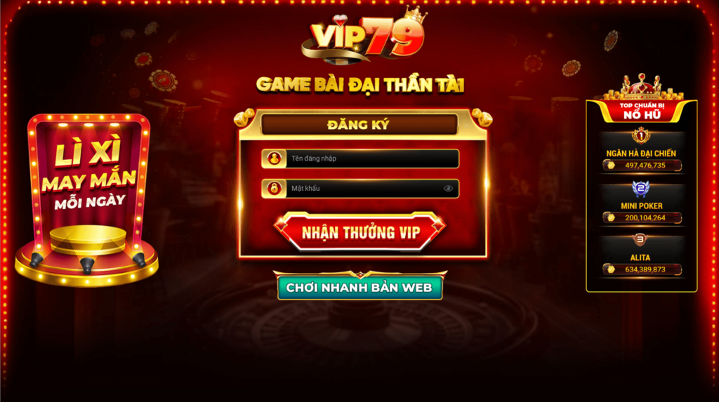
The second image is an example of a registration-focused pre-landing page, where users are prompted to create an account and immediately receive a VIP reward. The page is visually striking with bold text and offers an attractive reward for simply signing up. This method works especially well in retaining users through instant rewards such as “Li Xi May Man” (Lucky Money) and quick access to the gambling interface.
Key Elements:
- Interactive Gamification: The use of a spinning wheel or other “game-like” elements encourages users to engage actively with the page. This creates the feeling of a reward that is just one step away, driving urgency and excitement.
- Immediate Rewards: Offering rewards like “real cash” and valuable gadgets immediately captures user attention. The notion of an exclusive prize makes the pre-lander more compelling.
- Simple CTA and Registration Process: Both creatives emphasize a quick and easy sign-up process. For example, in the second image, the registration form is straightforward and directly tied to the reward, ensuring users don’t feel overwhelmed with unnecessary information.
Betting Pre Landing Page Design: Examples for Inspiration in 2026
In sports betting, pre-landers aim to engage users by promoting upcoming events and providing immediate, compelling incentives, like bonus offers. The key focus is to capitalize on the excitement surrounding sports events and motivate users to register and place their first bet.
Common Pre-landing Page Types:
- Sports-themed Bonus Offers:
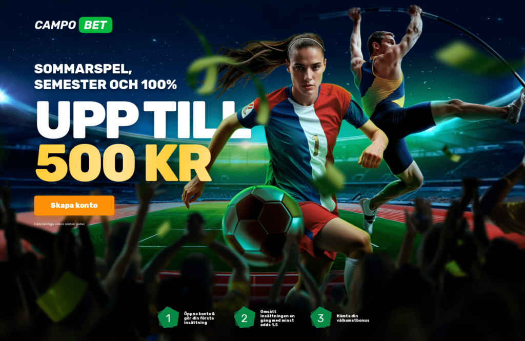
The example above showcases a pre-lander page where sports enthusiasts are presented with a visually appealing scene featuring athletes in action. This taps into the excitement of live sports, making the user feel a part of the action. The page offers a clear incentive — a 100% bonus up to 500 KR for signing up and making a deposit. The visual cues, like the intense focus of the athletes, evoke the thrill of competition, which aligns with the betting experience.
- Simple Sign-up Incentive Flow:
Below the central image, users are guided through a three-step process to claim their bonus, emphasizing how easy it is to create an account and start betting. This method reduces friction and increases the likelihood of conversion by making the sign-up process as straightforward as possible.
Key Elements:
- Sports-driven Visuals: This creative heavily relies on sports imagery, showing both a soccer player and an athlete mid-competition. Such visuals resonate deeply with the target audience of sports bettors, who are likely already invested in these events.
- Clear and Immediate Bonus Information: The “up to 500 KR” bonus offer is prominently displayed, making it the focal point of the page. Users are more likely to engage when they know there’s a significant reward waiting for them after registration.
General Tip: A potential user visits the pre-landing page, sees the sports-themed visuals, and is instantly drawn in by the energy of the scene. The straightforward bonus offer and easy registration process further encourage them to create an account, driving higher conversion rates for the betting platform.
In summary, this type of pre-landing page leverages the power of sports imagery and bonus-driven incentives to attract and convert users in the betting vertical. The visual appeal combined with a clear and enticing offer can be a highly effective strategy in driving user engagement and sign-ups.
High-Converting Pre-Landing Examples for Dating Vertical: Engaging Users with Visual Appeal
In the dating niche, pre-landers serve two main functions: to build curiosity and filter users by their preferences, whether by gender, location, or interests. By leveraging provocative visuals and interactive elements, these pages work to entice users and push them toward registering or engaging with the dating service.
Common Pre-landing Page Types:
- Interactive Spin-to-Win Wheels:
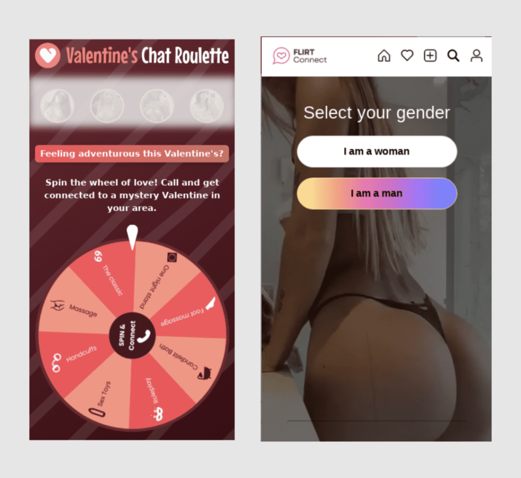
The first example shows a “Valentine’s Chat Roulette” with a spin-the-wheel feature. This interactive element invites users to engage with the content before even signing up, offering playful and provocative options like “The Classic,” “Massage,” or “Chocolate Bath.” Such pre-landers are highly effective in creating a fun, game-like atmosphere, which encourages user interaction and keeps them engaged long enough to take the next step: registering or engaging with a dating service.
- Gender Selection Pre-landers:
The second example provides a simple yet effective gender selection screen. Users are required to choose their gender before proceeding, which helps personalize their experience on the dating platform. The bold and provocative image in the background immediately grabs attention, making it clear that this is an adult dating service. The minimalistic design keeps the focus on the action users need to take, ensuring that there’s no distraction from the core objective — getting them to sign up.
Key Elements:
- Interactive Gamification: Gamified elements like “Spin the Wheel” provide an added layer of engagement. The playful and adventurous nature of the options offered on the wheel encourages users to interact with the pre-lander, while also subtly promoting the dating service as something exciting and unexpected.
- Provocative Visuals: Both creatives use bold, provocative visuals to capture user attention immediately. In the second example, the background features a suggestive image that leaves little to the imagination, reinforcing the type of service the user is engaging with. This visual strategy ensures that users know exactly what to expect from the platform.
- Personalization and Filtering: The gender selection option not only helps filter the traffic but also adds a layer of personalization. By selecting their gender, users feel like the platform is tailoring the experience specifically for them, which increases the likelihood of engagement.
General Tip: A user lands on the “Valentine’s Chat Roulette” pre-landing page and is intrigued by the spin-the-wheel feature. They spin the wheel, engaging with the playful options, and are then directed to a call-to-action encouraging them to sign up for a chat with a “mystery Valentine.” The game-like feature combined with the excitement of connecting with someone in their area adds an element of curiosity and drives the user to continue through the funnel.
In conclusion, interactive elements like the spin-the-wheel game and personalized filters such as gender selection work together to create engaging and tailored user experiences. These pre-landing pages combine provocative visuals with fun and accessible interactivity, which is a powerful formula for driving conversions in the dating vertical.
High-Converting Landing Page Examples for Finance: Building Trust
In the finance niche, the main goal of a pre-landing page is to establish credibility and motivate users to take a specific action — such as signing up for a loan, credit card, or investment platform. Since financial offers often require users to share sensitive data, the pre-lander must balance trust, clarity, and urgency.
Common Pre-landing Page Types
1. Survey and Qualification Pages
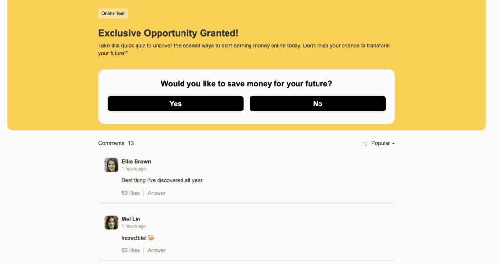
The first example is a classic finance pre-lander built around a quick survey. Users are asked simple questions like “Are you satisfied with your income?” or “Would you like to earn more?” This format works because it creates a feeling of personalization — users think the system is tailoring financial opportunities for them. Once the survey is complete, they’re redirected to the main offer page.
2. Corporate-style Pre-landings for Financial Platforms
The second example represents another popular approach — a clean, professional pre-lander styled after trusted financial or e-commerce brands. The goal is to inspire confidence and reduce friction before the user transitions to the main landing page. These pages often include search bars, brand logos, or “Start Now” buttons that lead to a financial product, investment offer, or loan service.

Key Elements
- Trust and Familiar Design: Finance users prefer pages that look legitimate — neutral colors, known brand layouts, and simple CTAs build trust.
- Step-by-Step Flow: Surveys and short questionnaires guide the user gently toward the final offer.
- Emotional Trigger: Questions about income or financial goals appeal to personal needs and curiosity.
- Clear Incentive: Promises like “Find a way to earn more money” or “Start earning right now” encourage immediate action.
E-commerce Pre-landing Page Examples for Affiliate Marketing: Personalizing the Shopping Experience
In the e-commerce vertical, the goal of a pre-landing page is to engage users with personalized recommendations, discounts, and high-quality visuals that highlight specific products or collections. These pages aim to create a smooth transition between the ad and the main shop, ensuring users feel motivated to explore the product offerings or make a purchase.
Common Pre-landing Page Types:
- Product Recommendation Pre-landers:
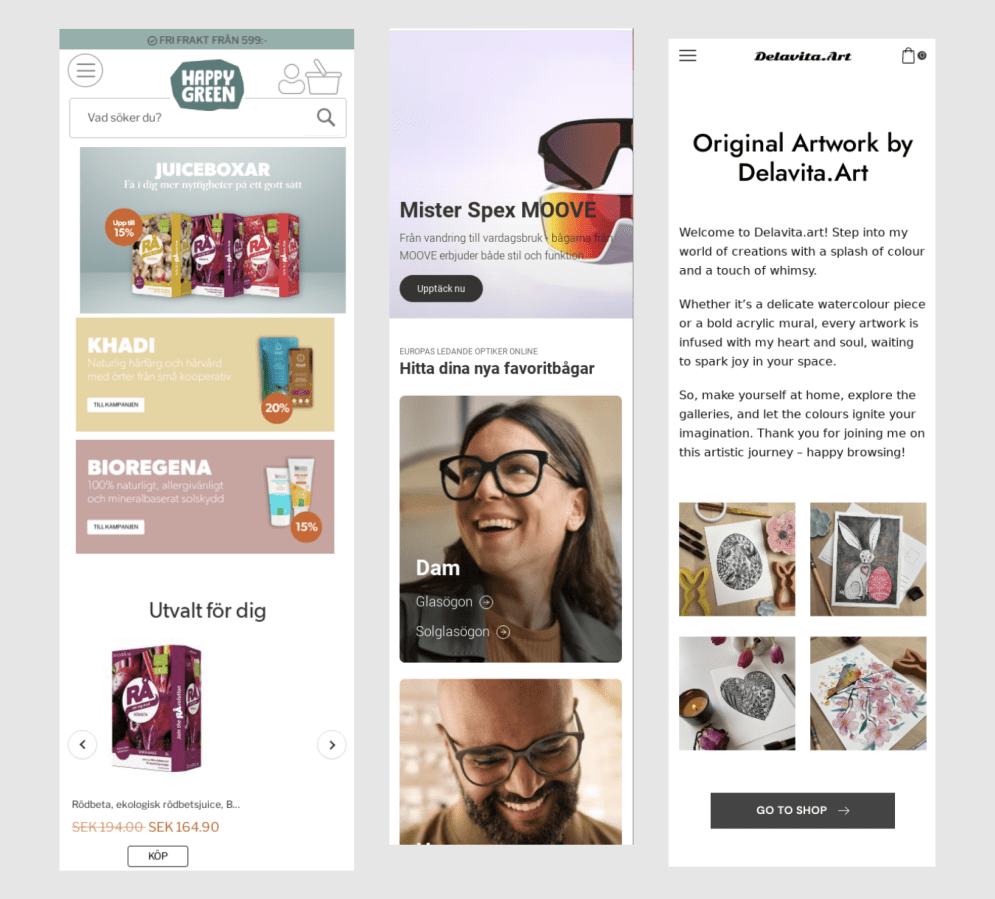
The first example from the uploaded image highlights a personalized selection of products. Pre-landers in e-commerce frequently showcase recommended items based on user preferences or past browsing behavior. This approach creates a sense of exclusivity and helps guide users toward products they are more likely to be interested in. The creative emphasizes discounts (e.g., 15%-20% off), providing additional motivation for the user to explore further.
- Category or Brand Showcases:
The second pre-landing page emphasizes a specific brand or product category, such as eyewear. The page is clean, with large product visuals and minimal text, making it easy for users to focus on the items. This type of pre-lander is ideal for promoting collections or seasonal offers. By directing users to a category they are interested in, the platform enhances engagement.
- Content-driven Pre-landers:
The third example, promoting original artwork, adopts a more content-rich approach. It uses storytelling to draw users in, explaining the artist’s process and philosophy behind the creations. This method is highly effective for e-commerce platforms selling handmade or high-end products, as it builds a deeper connection with the user by highlighting the uniqueness of the offerings.
Key Elements:
- Visually Clean Design: All three examples from the image share a clean, minimalist design. This ensures that users are not overwhelmed by too much information, allowing them to focus on the product or offer being promoted. The use of white space and high-quality product images draws attention to the items themselves.
- Personalized Offers and Discounts: By offering specific discounts, such as 15%-20% off, these pre-landers make the user feel like they are getting a special deal. The inclusion of product recommendations also adds a personal touch, encouraging users to explore further.
- Content and Storytelling: For brands or products that benefit from a more narrative-driven approach (like artisan goods), a content-rich pre-lander works wonders. By explaining the backstory or craftsmanship behind the products, you create a more emotional connection with the user, increasing the likelihood of conversion.
General Tip: E-commerce pre-landing pages that focus on personalization, clean design, and targeted offers are highly effective in converting traffic. By guiding users to curated product selections or categories and incorporating engaging storytelling, these pre-landers provide a seamless experience that encourages users to explore further or complete a purchase.
Sweepstakes Pre-landing Page Examples for High Conversion Rates: Turning Curiosity
Sweepstakes pre-landings work best when they play on human curiosity — the desire to win, test luck, or get a surprise reward. The structure is usually simple, but the goal is clear: create engagement fast and move the user toward the offer before their attention fades.
Common Pre-landing Page Types
1. Gift Box Reveal Pages
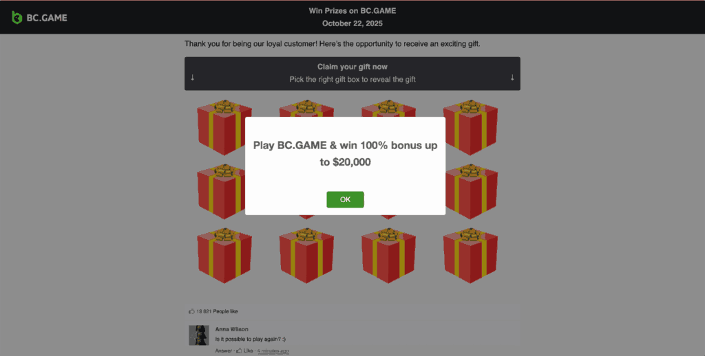
The first example (BC.Game) shows a popular “mystery reward” mechanic. The user sees several gift boxes and is invited to pick one to claim a prize. After clicking, a pop-up reveals the bonus — for instance, “Win a 100% bonus up to $20,000.”
This setup works because it gives the user a quick win. Even a small interaction feels rewarding, which makes them more willing to continue to the main offer page. The emotion here is excitement — you’ve already “won,” and the next step is just to confirm it.
2. Lottery Number Selection Pages
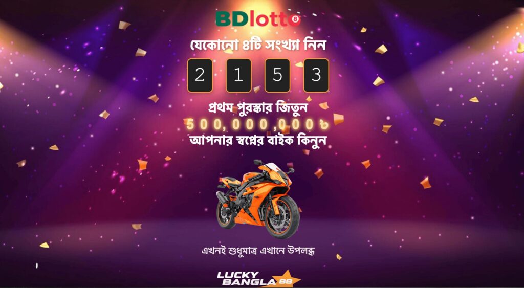
The second example (BDlotto) focuses on the lottery concept, where users choose a combination of numbers and instantly see if they’ve won. It uses bright visuals, motion, and large prize displays to build excitement — “Win your dream bike” or “Get up to 500,000,000.”
This format works especially well in regions where lottery culture is strong. It builds anticipation and gives a sense of participation — users feel they’re in control of their outcome, even though the process is automated.
Key Elements
- Gamified interaction: Choosing, clicking, or “winning” something keeps users emotionally involved.
- Instant feedback: Pop-ups and animations reward the user right away, keeping momentum high.
- Visual excitement: Bright colors, confetti, and bonus text create a celebration effect.
- Localized tone: Using the language, prizes, and imagery familiar to the target region improves trust.
- Straightforward CTA: A single button like “OK,” “Continue,” or “Check result” keeps the flow intuitive.
Utilities & Antivirus Pre Landing Pages That Convert: Building Trust Through Security
In the Utilities and Antivirus vertical, pre-landing pages are designed to highlight security concerns and provide immediate solutions to users. The goal is to make the user feel vulnerable without protection and then offer an easy fix, often in the form of a free download or a quick sign-up. The pre-landers focus on building urgency, often using language like “your internet connection may not be secure,” as shown in the examples.
Common Pre-landing Page Types:
- Security Warning Pre-landers:
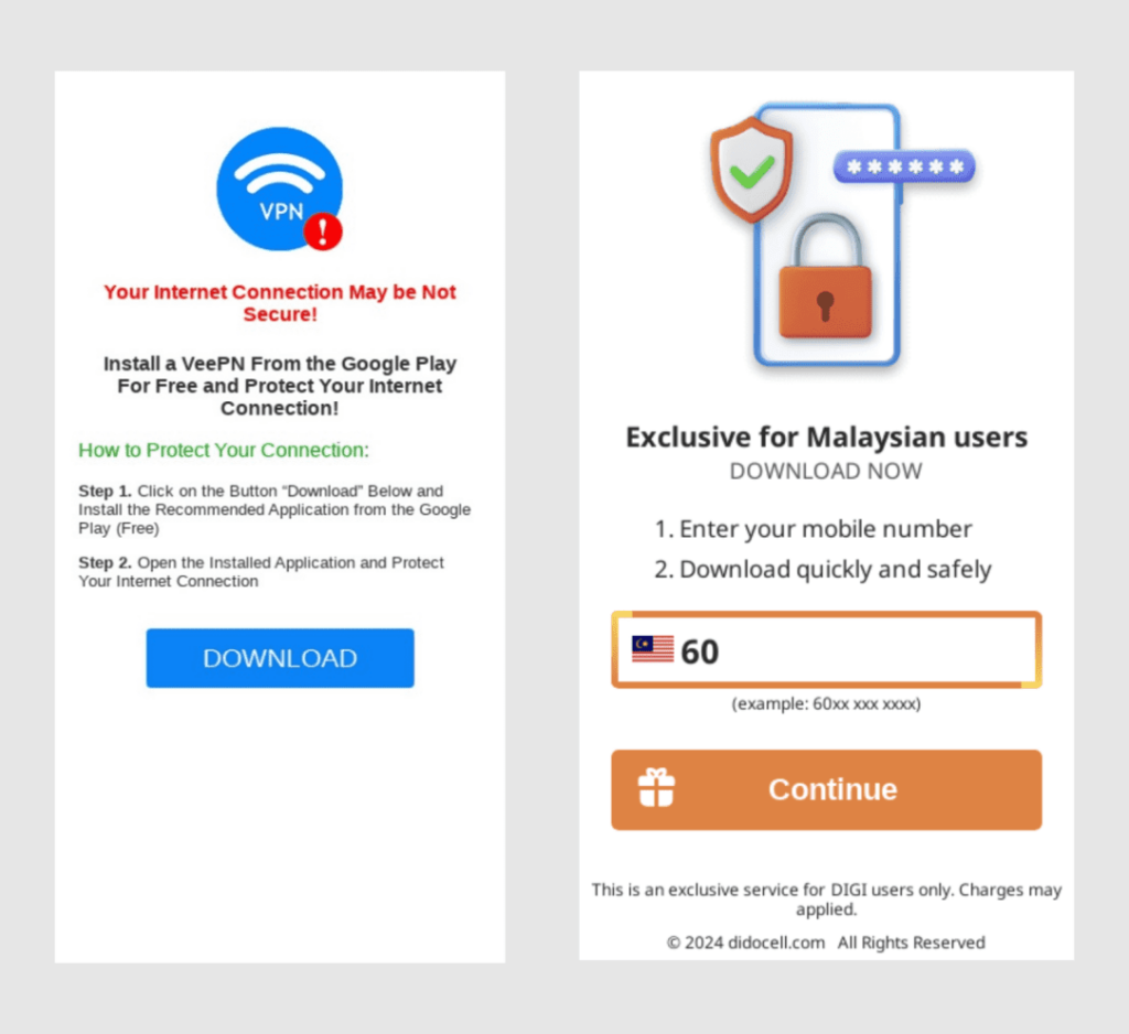
The first example depicts a clear security threat to the user’s internet connection, immediately prompting action. The message informs the user that their connection may not be secure and offers a free solution — downloading a VPN to protect their data. This type of pre-landing page works well because it plays on the user’s fear of being vulnerable online, encouraging them to take immediate steps to safeguard their connection.
- Exclusive Offer Pre-landers:
The second example is a location-targeted pre-lander offering a secure download exclusively for Malaysian users. It uses a step-by-step guide, asking for the user’s mobile number before offering a quick and safe download. This format appeals to users by creating a sense of exclusivity, making them feel like they are getting a service tailored to their specific needs.
Key Elements:
- Urgency and Fear-based Messaging: Both examples use urgency-driven language like “Your Internet Connection May Be Not Secure!” and “Exclusive for Malaysian users.” This taps into the user’s fears of being unprotected or missing out on a unique offer. The messaging creates a strong emotional drive, pushing users to take immediate action.
- Simple and Clear CTA: The call-to-action buttons are prominent and direct, with options like “Download” or “Continue.” The simplicity in the CTAs encourages users to act quickly without overloading them with too much information.
- Step-by-step Instructions: The pre-landing pages provide clear, step-by-step instructions for users to follow. Whether it’s downloading an app or entering their phone number, the process is laid out to make it as easy and frictionless as possible, reducing any hesitations that users might have.
General Tip: A user lands on a pre-landing page warning them that their internet connection may not be secure. The page highlights the dangers of an unprotected network and offers a simple solution: downloading a free VPN app. The user is guided through two easy steps — downloading the app and securing their connection. Alternatively, another user in Malaysia might see the second pre-lander, which asks for their mobile number to access an exclusive security download, creating a personalized experience.
In summary, utilities and antivirus pre-landing pages often use fear-based messaging and clear, direct CTAs to drive action. By making users feel vulnerable and offering a simple, free solution, these pre-landers are highly effective at encouraging downloads and sign-ups.
Nutra Pre-landing Page Examples: Building Trust with Science and Proven Results
In the Nutra vertical (health and wellness products), the main objective of a pre-landing page is to build credibility and trust in the product being promoted. Often, Nutra pre-landers rely on scientific claims, testimonials, and before/after results to convince users that the product is both safe and effective. The goal is to lead users toward making an informed decision by showcasing real-life results and highlighting the product’s unique benefits.
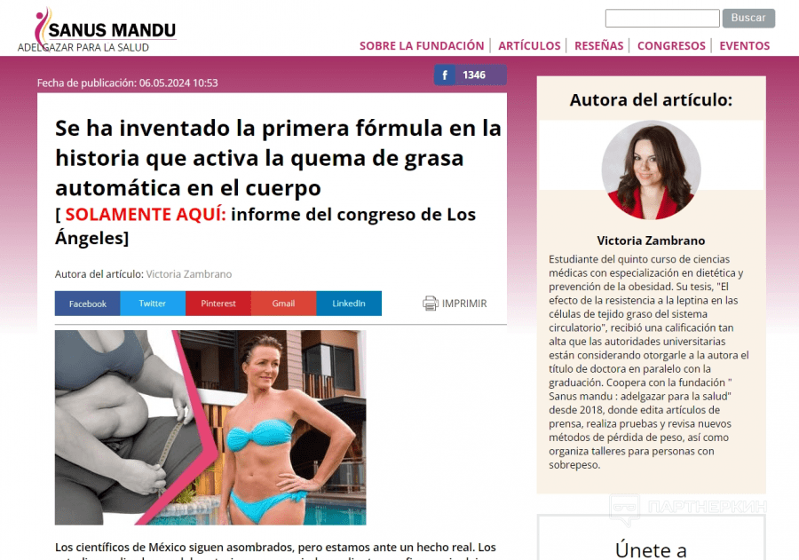
Common Pre-landing Page Types:
- Before/After Success Stories:
The example follows a classic Nutra approach, where users are shown compelling before-and-after visuals of someone who has benefited from the product. In this case, the image contrasts an overweight individual with the same person after significant weight loss. This visual proof, combined with an emotional appeal, plays a powerful role in driving conversions. The pre-landing page uses phrases like “the first formula in history to activate automatic fat burning,” positioning the product as groundbreaking and revolutionary.
- Medical or Scientific Endorsements:
Many Nutra pre-landers also include endorsements from doctors, scientists, or industry experts. The example includes the author’s profile, detailing her credentials in dietetics and obesity prevention, adding authority and trust to the claims made on the page. This type of scientific validation can persuade skeptical users to believe in the efficacy of the product.
- Exclusive Research or Discoveries:
Another strategy frequently used in Nutra pre-landers is presenting the product as a secret or exclusive discovery, often backed by a specific study or congress. The example references a “report from the Los Angeles Congress,” giving the impression that the product is backed by cutting-edge scientific research, which makes users feel they are accessing something innovative and exclusive.
Key Elements:
- Compelling Visuals and Proof: The most impactful Nutra pre-landers always feature strong before/after images that visually demonstrate the product’s effectiveness. In this case, the weight loss transformation grabs the user’s attention immediately and adds credibility to the product claims.
- Scientific and Medical Validation: Featuring expert opinions or scientific studies, as shown with the inclusion of the author’s academic background, strengthens the page’s message. This authority is crucial in the health and wellness sector, where trust is a key driver for conversions.
- Urgency and Exclusivity: Using language that implies urgency and exclusivity, such as “Only here” or referencing exclusive reports, gives users the feeling they are accessing something rare or time-sensitive, encouraging them to act quickly.
General Tip: When creating a Nutra pre-landing page, it’s essential to hook users immediately with a powerful visual transformation, such as a before-and-after image. This grabs attention and establishes credibility. Then, follow up with claims backed by scientific research or expert endorsements. Make sure to feature these credentials prominently, as they help to build trust and reduce skepticism. Users are more likely to engage when they see a combination of visual proof and expert validation, especially if the product is framed as an exclusive or innovative discovery. This blend of emotional appeal, visual evidence, and scientific authority is what drives users to click through to the landing page and seriously consider purchasing the product.
In conclusion, focusing on these elements — trust-building visuals, expert-backed claims, and a clear, compelling message — will greatly enhance the effectiveness of your Nutra pre-landers and boost conversion rates.
Maximize Conversions with ROIads: Unlocking Success in Top Vertical Markets
As we’ve just seen, verticals like iGaming, Betting, Dating, Utilities & Antivirus, E-commerce and Nutra can significantly benefit from the right pre-lander page strategies. These verticals aren’t just theoretical examples — they represent the top-performing sectors on ROIads, where advertisers enjoy premium traffic and advanced optimization tools tailored to each campaign.
Key Advantages of ROIads Ads Network
- Massive Reach: Over 900B monthly impressions for scaling campaigns in any vertical.
- Global Coverage: Traffic from 150+ countries, reaching diverse audiences worldwide.
- Ad Formats: Push, pop, in-page push, direct click ads — flexible options for iGaming, Nutra, Antivirus, and more.
- Micro Bidding: Adjust bids per source to control spend and boost performance.
- AI Bidding Technology: Real-time optimization to get the best ROI automatically.
- CPA Goal: Keeps your campaigns within target CPA by auto-adjusting bids and traffic flow.
- Optimization Rules: Automate routine tasks — pause weak creatives, block bad sources, and manage budgets hands-free.
- Low Pricing: Push CPC starts at $0.003, pop CPM from $0.5 — great for Tier 2–3 testing.
- Advanced Targeting: Segment by geo, device, OS, or browser with detailed stats and automation tools.
- Fraud Protection: Advanced anti-fraud systems ensure clean, verified traffic.
- Personal Support: Get a dedicated manager for setup, optimization, and custom creatives.
Learn more about pre-landers and affiliate funnels in ROIads expert blog. In there, ROIads team shares case studies, practical tips and insights for every vertical and format, helping you launch smarter.
Typical Mistakes in Pre-landing Pages
Even strong campaigns can fail if the pre-lander doesn’t do its job. Here are the most common mistakes affiliates make — and what to do instead:
1. Too much text and clutter
Pre-landers should be light and focused. Long paragraphs, walls of text, and overloaded layouts kill the flow. Keep it short, visual, and easy to scroll — users decide in seconds whether to stay or leave.
2. Weak or confusing CTA
If the user doesn’t understand what to do next, you lose the click. Avoid generic buttons like “Learn More.” Use clear actions — “Continue,” “Claim Bonus,” “Start Now.” One CTA per screen is enough.
3. Mismatch between ad and pre-lander
When the ad promises one thing and the pre-lander shows another, users bounce immediately. Always keep the message, tone, and visuals consistent from ad to pre-lander to landing page.
4. No clear value or emotional trigger
A pre-lander isn’t just a bridge — it’s where you convince the user to care. Add an emotional or practical reason to continue: reward, success story, bonus, or limited offer.
5. Overly slow or heavy pages
Every second matters. Heavy scripts, big images, or animations can break the funnel. Test your pre-landers for load speed on both mobile and desktop.
6. Ignoring mobile optimization
Most traffic today comes from mobile — especially push and pop. If buttons are too small, text overflows, or elements break, conversion rates will collapse.
FAQ: What People Also Ask About Pre-landing Pages
❓ What is a pre-landing page in affiliate marketing?
A pre-lander is a short page that sits between the ad and the main offer. Its main goal is to warm up the user — grab attention, build trust, or spark curiosity before they reach the landing page. When it’s done right, it filters out random clicks and keeps only users who are really interested, which helps you get cheaper and more stable conversions.
❓ How do pre-landers improve conversions?
They prepare people before the final step instead of sending them straight to the offer. A solid pre-lander explains what’s next, answers quick doubts, and builds motivation to continue. In niches like gambling or finance, showing a small bonus, “limited-time offer,” or quick success story can instantly push users to take action.
❓ Which verticals need pre-landing pages most?
Pre-landers work best in verticals where users need an extra push — gambling, betting, finance, nutra, and sweepstakes. In these niches, emotions and trust matter most, so even a short warm-up page can turn a casual visitor into a real lead.
Conclusion
Now that you’ve gained valuable insights into pre-landing strategies across key verticals, it’s time to put them into action. With its global reach, AI-powered optimization, and low-cost push and pop ads, ROIads provides everything you need to launch a high-converting campaign. Take the next step and see how these strategies can drive real results for your business.


